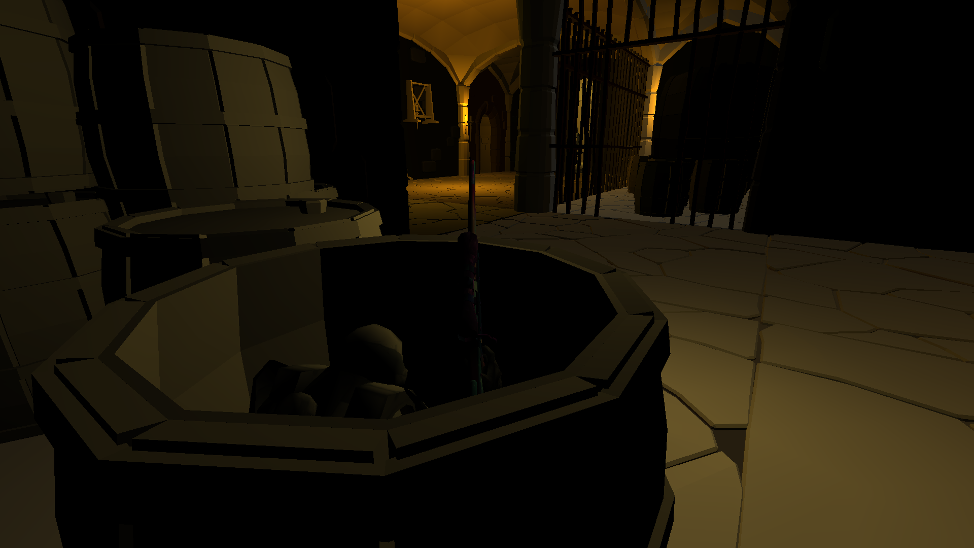
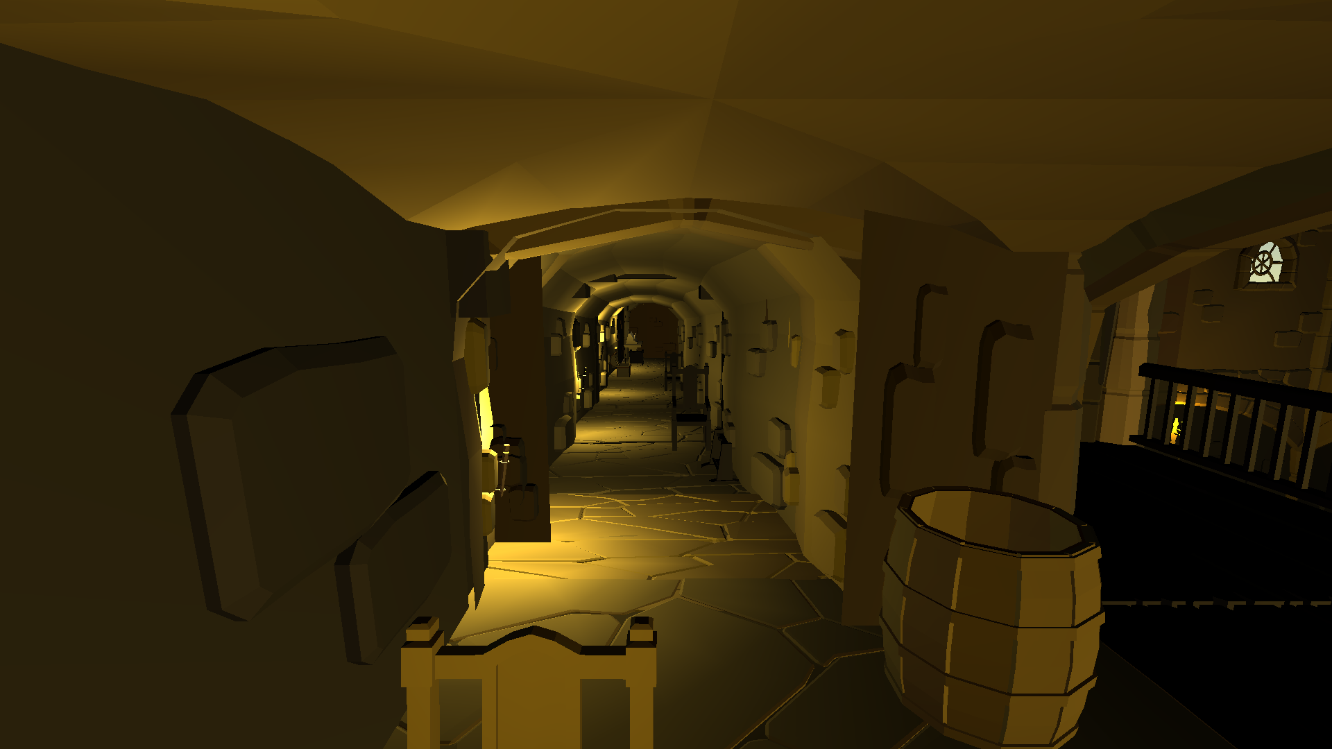
well I made six maps, but in the end, I decided to just publish one map
that's why does it look like
well I don't think someone will play hide and seek in my map
but I hope :D
the best quality in the map is " THE FASTEST ", don't set any quality which is higher than " FAST ", or the map will be a dark house lol
And u can hide in some opening barrel in the map :O
Status: Pending map (0_o emmmmmm )


maybe :)
11/8/2020
Update a thing @a@
1. make a new way to go to opponent's base
btw, Granny probably is behind u ╰(*°▽°*)╯
( Should I add a Granny photo in the map
This post was edited by MRNOOB at August 11, 2020 2:19 AM PDT

Cool map, but I suggest reducing the number of spot/point lights.
Unity has a limit on how many lights can shine at once, so as you move in the game it causes flickering.
I recommend one spot/point light per corridor and for the rest of the illumination add a Directional light and reduce its intensity, to keep dark atmosphere while keeping it illuminated.
Also remove the skybox in Render settings or replace it with a night themed skybox (would fit better the map, especially when looking through the window).
I just start making map last week actually, not rlly know how to make a map perfectly and use those tools flexibility, especially is the light problem, it is very annoying for me So thx ur suggestion :) , I will try to add those thing into my map ( I actually is a new map maker lol)
17/8/2020
update
make a secret place , fix the light problem ( thx max :)
and move the naz! leader meme to the secret place
18/8/2020
add a piano music in secret place ( not full version cause the file is too big )ಠ_ಠ
the piece called : prelude in G minor by Rachmaninoff ( finally spell his name correct lol )
and it probably is the last update in this year bc i can't play recently ಥ_ಥ
btw , keep close to the piano so that u can hear that :-D
( if still can't hear....just set it be louder )
Just tried the new update and here are some suggestions:
- Disable shadows in the directional light, since they look unnatural in the indoor maps.
- Reduce intensity of directional light, right now it looks like daylight (Try setting it 0.1, or just see until the lighting looks somewhat similar to a previous version).
The previous lighting looked good, but due to limitation of Unity, all lights couldn't shine at the same time. So the goal is to use as fewer lights as possible while trying to keep the same atmosphere.
Edit: Also you might want to tweak ambient color in the Render settings (to fix dark walls).

but whatever i will try to follow ur suggestions if possible for me the nub map maker ;D
oh thx , idk there is a thing that can change shadow's colour , oh yeah thx u very muchhhhhhh ヾ(≧▽≦*)o